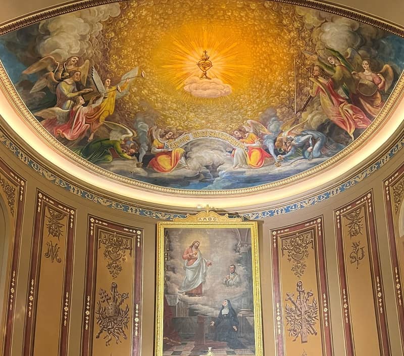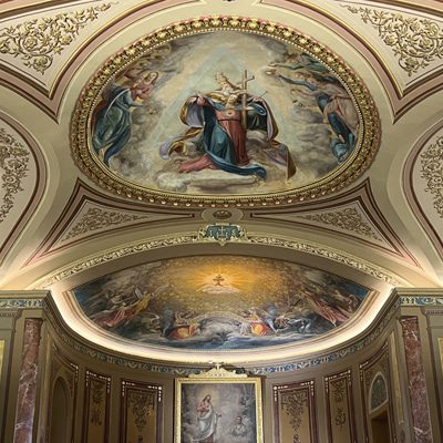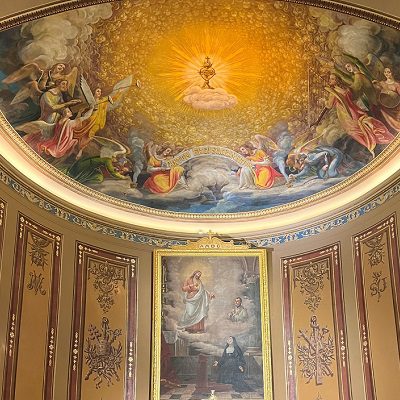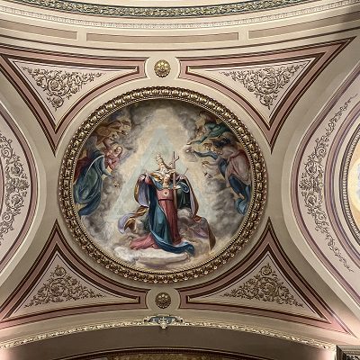
In 2023 Canning Liturgical Arts conserved and restored the interior decorative program of the Basilica of the Sacred Heart of Jesus in Hanover, PA. [See the Basilica’s portfolio and our three-part series on the history and artistic context of the Sacred Heart decorative program.] While this work was taking place, a sign board proclaiming the history of the building was found in a barn on the property. Despite sitting on a dirt floor for decades and its worn and damaged presentation, John Canning, founder of John Canning & Co., was immediately impressed by the skillful hand lettering of the unknown artisan. He was drawn in particular to the alphabet design, which he recognized as one advocated by the nineteenth-century English architect and theorist Augustus Welby Northmore Pugin (1812-1852). Canning appreciated this old sign as an important relic of the Basilica’s history and worthy of restoration to match the church interior.
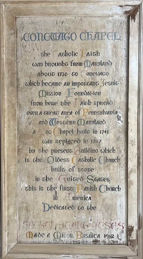
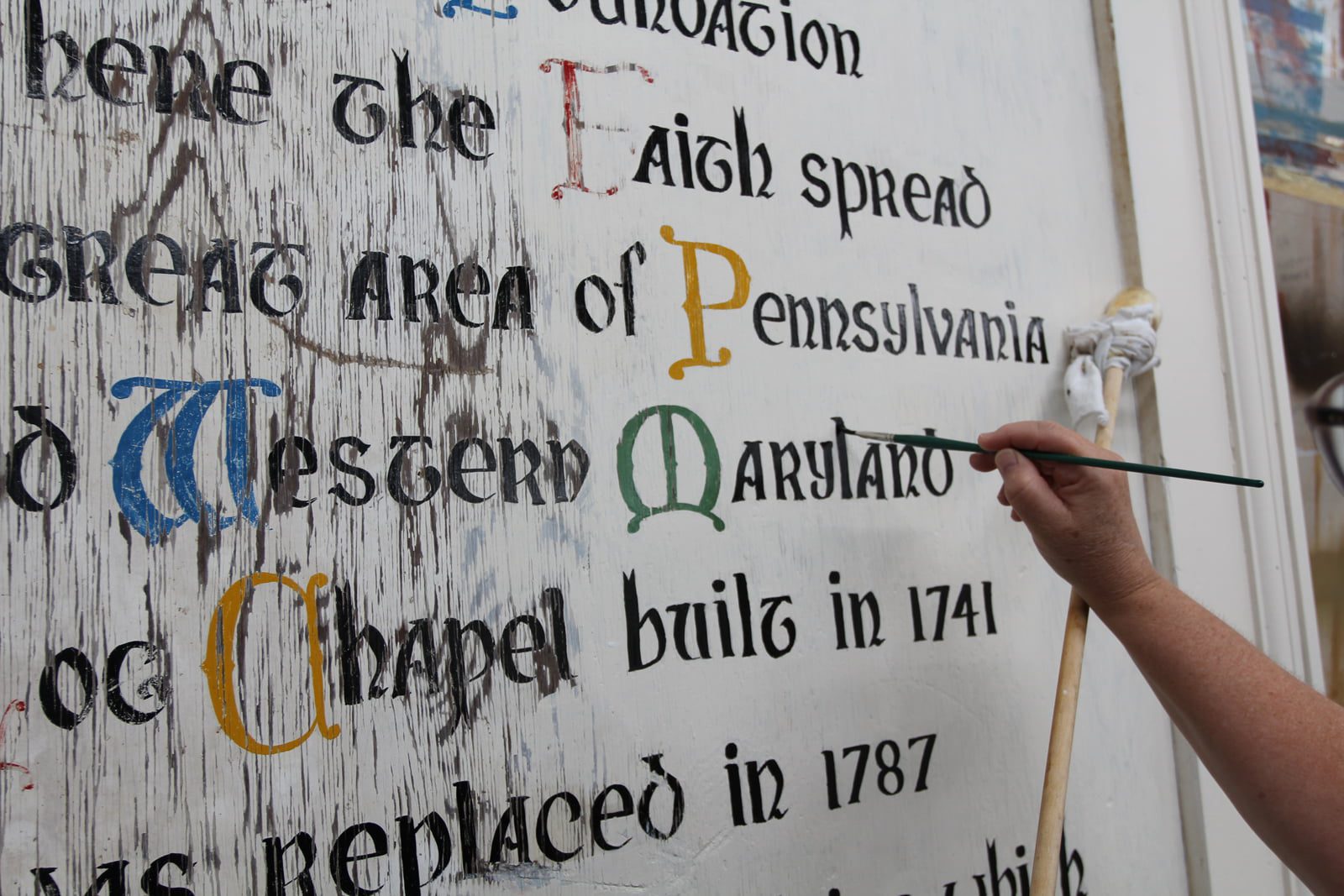
Original Conewago Chapel Sign Board
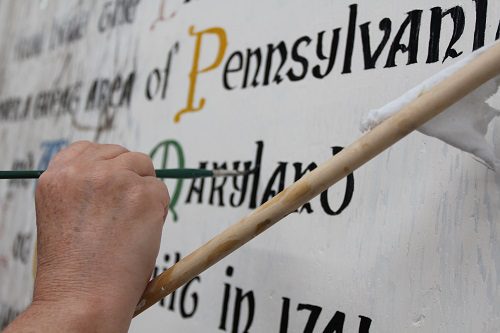
Close-up of Jacqueline Canning Riccio in-painting and reconstructing of faded and damaged lettering on Chapel Sign Board
Measuring approximately 55” x 108”, the sign board is made of plywood and framed with a solid hardwood molding. It was originally primed, undercoated, and finished with linseed oil and lead paint in off-white. The lettering was hand-painted using a chisel-edged sable hair brush. A lead-based paint in black was used for the bulk of the text and three primary colors plus green for the initials. The presence of lead paint suggests that the sign board was made c. 1962-1970. Conservation treatment included repair to the frame, cleaning and repainting of the background, and in-painting and reconstructing of faded and damaged lettering. Jacqueline Canning Riccio and Zoe Riccio, daughter and granddaughter of John Canning, were called upon for this task. Their expert brushmanship and attention to detail in the required conservation treatments are evident in the elegance and precision of the final presentation of the restored sign board.
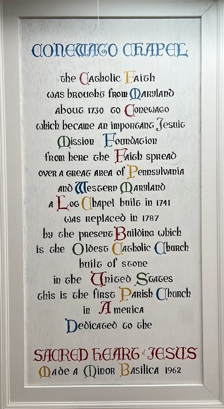
Conserved Original Conewago Chapel Sign Board -Present Day: Basilica of Sacred Heart of Jesus
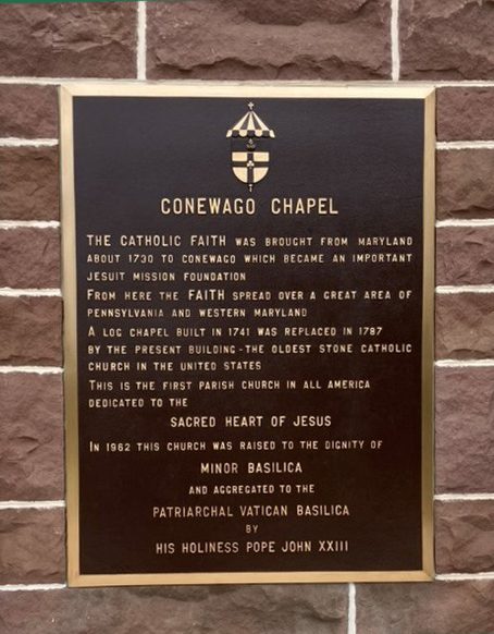
Basilica of Sacred Heart of Jesus Plaque
The inscription largely corresponds to that on a bronze plaque that is presently displayed on the church façade. It traces the history of Sacred Heart from the earliest Jesuit mission to the Conewago Valley in c. 1730; to the original log chapel built in 1741; to the present stone church built in 1787; and finally, to the conferral of the honor of minor basilica in 1962. Since much of the damage to the sign board suggests that it was exposed to the elements, it is very possible it once hung on the façade of the church and when it became too dilapidated for continued display, the brass plaque was installed to replace it.
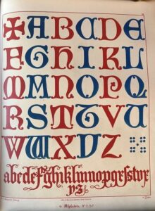
Pugin’s alphabet
The Gothic style of lettering used on the sign board is derived from an alphabet of letters used in the 13th and 14th centuries and published in Pugin’s Glossary of Ecclesiastical Ornament and Costume (1844). Intended as a sourcebook for artists and craftsmen, the Glossary included color plates for the express purpose of imitation by hand. (The alphabets published in the Glossary were never translated into a typeface for metal type reproduction.) With their gentle organic serifs and bold, flat colors, the lettering style expressed what Pugin had admired in medieval paving tiles and Turkish rugs: nature as an abstract play of pure forms. (See E.H. Gombrich, The Sense of Order: A Study of Psychology of Decorative Art, Cornell UP, 1984, p. 34-37.) Adopted by both the Anglican and Roman Catholic churches in their architectural ornamentation and decorative arts, variations of this alphabet can be found in monograms and inscriptions in polychrome plaster, wood, stone, metalwork, and embroidered fabrics. Indeed, Canning himself worked on restoring Pugin-inspired monograms here in Connecticut, including the ceiling bosses in the nave and aisles of St Patrick’s Cathedral Norwich (1871-1879), the Trinity Shield in the Our Mother of Perpetual Help Chapel at Thomas Aquinas College (1909), and the Trinity Shield in the Battell Chapel at Yale University (1874-76).
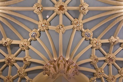
St Patrick’s Cathedral 2013 restoration, ceiling bosses
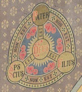
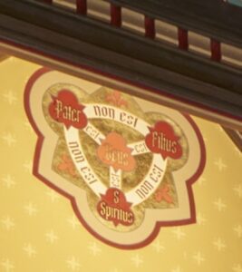
(Left) Yale University’s Battell Chapel 1987 restoration, Trinity Shield (Right) Thomas Aquinas College, Our Lady of Perpetual Help Chapel 2021 beautification, Trinity Shield
The influence of Pugin on the Basilica sign board was profoundly compelling to John Canning. As a young boy growing up in Glasgow, Scotland, Canning’s school, St Alphonsus, was designed by Pugin sometime in the 1840s, and his parish church, also St. Alphonsus, was designed by Pugin’s son Peter Paul Pugin in 1905. From the age of sixteen, Canning undertook a five-year apprenticeship as a church decorator. Sign writing was both a part of his training and a part of the cultural climate in which he worked and lived. Meticulous and beautiful hand-produced signs for shops and pubs and reverse glass painting on store front windows encouraged in Canning an appreciation for the craft and a fascination with the Victorian aesthetic that influenced these designs. Most importantly, he was attracted to the artistic principles of Pugin and his contemporaries that informed all the work he saw around him.
“That art has its fixed principles, any departure from which leads to inconsistency and unmeaning effect, is a truth never to be lost sight of.”
This foundational maxim published by Pugin in his Introduction to the Glossary became a guiding light for Canning and eventually for the business he built, John Canning & Co. In viewing the Basilica sign board, he could see the “fixed principles” of sign writing that he had learned in his apprentice days applied with elegant precision:
(1) Lettering should be easily read, devoid of embellishments that detract from its legibility;
(2) Lettering must be well-shaped, well-spaced, and have good tonal contrast to its background;
(3) There should be good layout of marginal space;
(4) Execution should be clean with sharp edges, the layout centered and well-balanced.
In adhering to these age-old principles, the unknown sign writer had produced a sign that in Canning’s estimation is both “appropriate and exquisite.”
However, before the meticulous craftsmanship and the thoughtful application of principled design, the Basilica sign writer made an important and seemingly unexpected aesthetic decision: to use Gothic lettering for a building that neither in its architecture nor its decoration has an affiliation with that style. Neither the Federalist exterior of restrained and largely unadorned red brick nor the interior decorated with a complete Italian Baroque-revival program evokes the Gothic. Yet this inconsistency of style is not problematic when considered in the context of the point and purposes of architectural inscriptions, specifically those adopted by Pugin.
In her article “Engaging the Mind’s Eye: The Use of Inscriptions in the Architecture of Owen Jones and A. W. N. Pugin (Journal of the Society of Architectural Historians, vol. 60, no. 2 (June 2002): p. 158-179), Carol Flores describes three functions of architectural inscription: the presentation of information about the building; the enhancement of the aesthetic impact of the building; and the evocation of particular associations. (Flores p. 158-159) The Basilica sign fulfills the first pragmatic function as its inscription is a summary of the history of the church, culminating with its distinction as a minor basilica in 1962. It also accomplishes the second aesthetic function by the controlled beauty of design and execution noted by Canning. Owen Jones (1809-1874), a contemporary of Pugin in architecture and design, noted how calligraphy in Islamic cultures was valued for the beauty of its form. (Flores p. 161) So too the Basilica sign with its delicate letterforms would have once served as a visual delight on the austere red brick façade of Sacred Heart. Finally, the Basilica sign achieves the third philosophical function as the use of Gothic lettering itself – before and separate from the meaning of the text – conveys the experience of sacredness in the eye of the viewer. (See Flores p. 176 for a discussion of perception and ornamental inscription as described in Oleg Grabar, The Mediation of Ornament, Princeton UP, 1992.)
The notion that “Gothic is Christian” was vehemently asserted by Pugin. Having entered the Catholic Church in 1835 at the age of 22, he promoted artistic theories marked by the passion of the convert. In his deeply polemical work Contrasts (1836), the medieval period, stood as the ideal model of an age of good design resting on a foundation of religious feeling. He argued that the age of the Reformation, by contrast, brought about a decline in the arts as a result of a general societal spiritual decline. Styles that were expressive of what he called “paganism” or “Italian paganism” were deemed unsuitable for Christian art and architecture, and to favor Gothic was a “principled choice” that arose from true Catholic feeling. (Phoebe Stanton, Pugin, Thames and Hudson, 1971, p. 92.) Indeed, as Cardinal John Henry Newman (1801-90) reacted to Pugin’s intolerance to any style other Gothic: “The Canons of Gothic architecture are to him points of faith, and everyone is a heretic who would venture to question them.” (Quoted by Nikolaus Pevsner, Preface to Stanton, p. 7.)
Since the publication of Contrasts, Gothic has been firmly identified with Christianity. (Gombrich, p. 216) The Basilica sign writer, in choosing Gothic lettering, made that association visually apparent. Even before reading the content of the inscription, the viewer is put in mind of the sacred and of the deep history of the Church, a history that can be traced centuries earlier than the first mission to Conewago. And so despite – or in spite, as Pugin might have had it – the “pagan” Roman interior and the Federalist exterior of the Basilica of the Sacred Heart, the Gothic style employed on the sign board is, in fact, remarkably appropriate.
With the rapid technological transformations of the graphic design industry, sign writing as an art has largely been lost in the last 40-50 years. The Basilica sign board is, therefore, not only an artifact of the church it celebrates but also a testament to the skills and expertise of craftsmen of a bygone era. Thanks to John Canning’s discerning eye and passion for restoration, the Basilica sign board has been rescued from neglect and its place in the history of Catholic Conewago as well as the history of design is preserved for generations to come.
Written By Amy Marie Zucca, Ph.D.

Amy Zucca is the resident art historian for John Canning & Co. and Canning Liturgical Arts. With a doctorate in art history and a specialization in the Italian Renaissance, Amy brings historic insight to our projects, new art commissions and design work for the company. If you have a painting you’d like to have evaluated for its historic significance or are interested in commissioning artwork for your sacred space, please contact Amy directly at amy@johncanningco.com.